Work | Testing | QNB
QNB
Logo & Colour Testing.
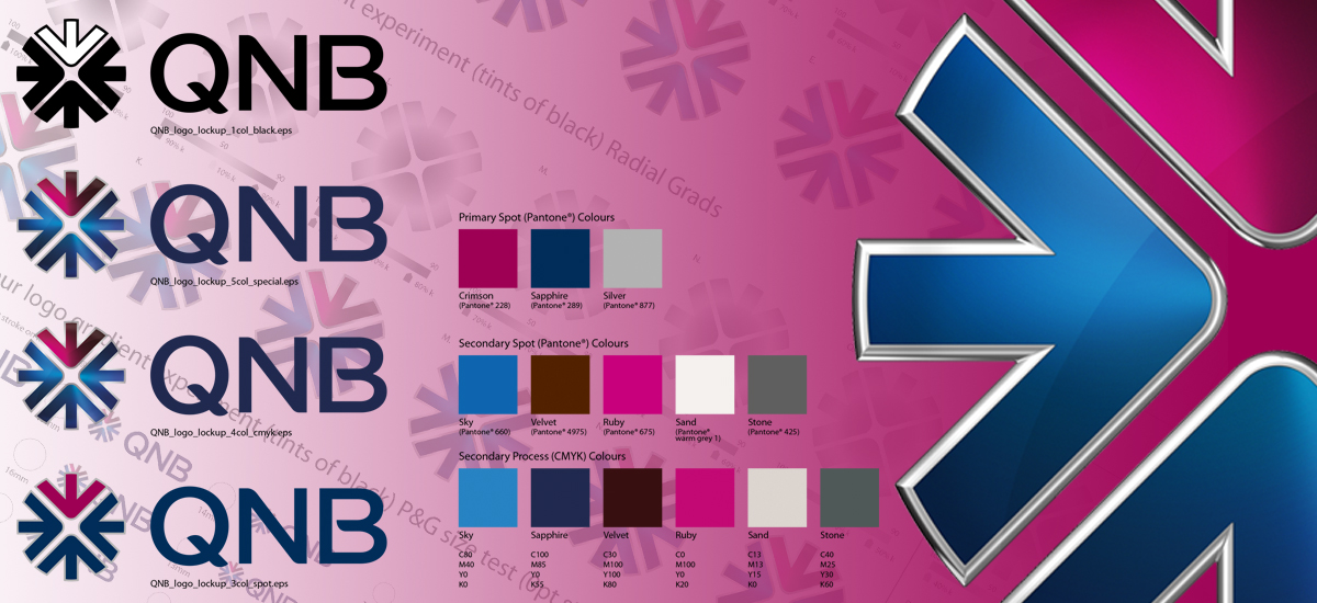
Brand Union, now (super union) asked us to help them create the logo & assets for QNB one of their clients at the time. We took the design files which were our base start point early on in the production/design process & were tasked with a number of tests to determine the final look & feel of the logo. Ordinarily, you might think this would be a design only phase however due to the technicalities & options that needed specialised consideration this quickly became a production test phase to determine pitfalls & printing issues that needed ironing out prior to brand guideline inclusion, rulemaking & asset delivery.
The various tests included the weight of lines Pantone spots & CMYK equivalent comparisons, foiling options, mock chrome effects, metallic inks etc. The logo also had gradients therefore many options had to be drawn up with varying adjustments so that wet proofs could be undertaken. Preferred options were then chosen based on the physical data retrieved from these tests. These tests also included varying sizes to determine at what size certain aspects of the design were no longer readable or optimal to the naked eye.
Once all these tests had been resolved a final set of rules were written up & included in the final brand guideline documentation, along with a master library of logos & assets to include all colour variants, in all file formats for both digital & litho applications.
If you are in need of a little extra help in achieving your creative goals,
need some advice or simply need to offload a project you have no
internal resource for then get in contact today.
QNB Testing
& Asset Creation
QNB Mock Chrome Edged Roundel

Clients